BRAND GUIDELINES OVERVIEW
Browse our brand guidelines, find the assets you need, download files, submit project requests and receive approvals for designs.
Who should use this guide?
Brand Structure:
The Church is God’s plan to reach North America and the nations with the hope of the gospel, and the North American Mission Board is here to help. To best pursue our mission, we have a family of brands, with a shared ethos, uniquely created to serve different audiences and needs.
Our five primary brands each stand for a specific focus within our ministry assignment and have unique audience goals. Our brands include, NAMB (Evangelism and Leadership), Send Network (Church Planting), Send Relief (Disaster Relief and Compassion Ministry), GenSend (The Next Generation), and Chaplaincy. Our brands strive for consistency and effectiveness, and each plays a specific role in our communications. Understanding each brand’s purpose is critical to helping NAMB maximize its mission to North America and the nations. Within our brand ecosystem, we have a system of categories (extensions, products, campaigns, events and partnership definitions) that allow flexibility and consistency for all of our communications.
Aesthetic:
The majority of our communications should support these focus areas and not dilute the long-term value that they create. Each logo should be used with care and follow the usage guidelines to protect the quality and integrity of how it is applied.
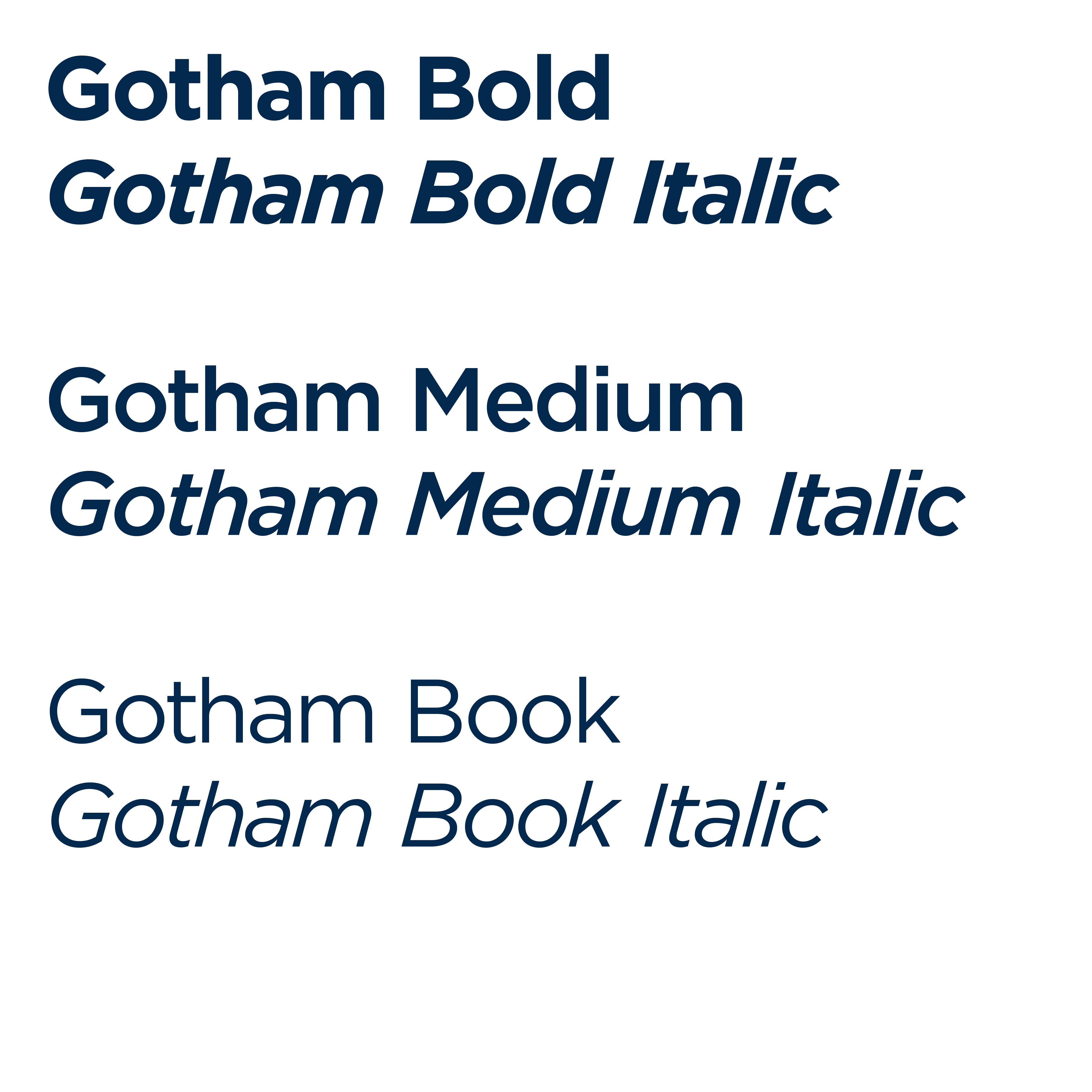
Our family of brands is visually connected through two specific tools: color and typography. These visual drivers help all four of our primary brands to feel similar yet distinct and customizable to the needs of the audiences they serve.


