GENSEND
Description:
GenSend is the Southern Baptist next-gen ministry equipping student and youth leaders to reach and disciple the next generation. With practical, relevant and up-to-date opportunities and resources, GenSend empowers students to live on mission.
Brand Attributes:
Vibrant. Authentic. Missional
Key Audiences:
Colors:
The GenSend color palette serves as a foundational component that works universally across all media. These colors anchor and balance the brand visually. Use the supporting secondary and tertiary colors to complement the system and strengthen brand recognition.
GENSEND PRIMARY
WEB: #10294C
PMS: 2767
CMYK: 100 86 41 41
RGB: 16 41 76
GENSEND TERTIARY
WEB: #3C7CA0
PMS: 7697
CMYK: 79 44 23 2
RGB: 60 124 160
GENSEND TERTIARY
WEB: #69C9CA
PMS: 325
CMYK: 55 0 24 0
RGB:105 201 202
GENSEND TERTIARY
WEB: #363795
PMS: Blue 072
CMYK: 96 95 0 0
RGB: 54 55 149
GENSEND TERTIARY
WEB: #992062
PMS: 234
CMYK: 38 100 35 10
RGB: 153 32 98
GENSEND TERTIARY
WEB: #F17F6F
PMS: 170
CMYK: 1 63 52 0
RGB: 241 127 111
GENSEND PRIMARY
WEB: #99CC67
PMS: 7487
CMYK: 44 0 79 0
RGB: 153 204 103
GENSEND TERTIARY
WEB: #50B849
PMS: 361
CMYK: 70 0 99 0
RGB: 80 184 73
GENSEND SECONDARY
WEB: #E56B27
PMS: 1585
CMYK: 6 71 98 0
RGB: 229 107 39
GENSEND TERTIARY
WEB: #FBAC33
PMS: 130
CMYK: 0 37 90 0
RGB: 251 172 51
GENSEND TERTIARY
WEB: #E5DED3
PMS: 7527
CMYK: 7 8 13 2
RGB: 229 222 211
GENSEND TERTIARY
WEB: #EBECED
PMS: 663
CMYK: 7 4 4 0
RGB: 235 236 237
Logos:
This is the approved GenSend Logo.
Using the logo:
To protect the integrity of the GenSend brand visual identity, please avoid altering the logo in any way. Use the supplied logo files as is. You may scale the size of the logo if needed, but always scale proportionally. Any use of the GenSend brand mark or GenSend brand assets should be submitted to brandapprovals@namb.net for approval prior to use.
Please keep the following in mind when using the GenSend logo:
- Do not scale or colorize logo elements independently.
- Do not place on backgrounds that affect readability of the logo.
- Do not modify color or logo design or add any elements to the logo.
- Do not stretch or skew logo in any way. If scaling logo, ensure it is done proportionately.
- Do not rearrange logo elements.
- Do not crop or bleed off page.
- Do not place inside a non-approved holding shape.
- Do not tilt or rotate.
- Do not add dimension (emboss, drop shadows, etc.).
- Do not add stroke or outline.
- Do not misrepresent NAMB or affiliates.
- Keep sufficient clear space around logo.
Typography:
Photography:
Photography should be the primary element used in GenSend designs to give a storytelling feel and evoke emotion. GenSend’s photography style is candid and aims to capture real, authentic moments that highlight the people and the ministries being featured. Natural lighting should be used whenever possible; avoid a direct flash or staged lighting. Use full-color photography as much as possible to bring color to design without relying solely on graphics. Duotones, if used, should be used sparingly and are typically best when used as a background/support image (although, full color photography with a dark overlay effect is preferred). With all of our photography, we strive to reflect the diversity in ethnicity, gender, age, background and community that our denomination represents.

Graphic Devices:
GenSend’s graphic elements consists of patterns, accent type and graphic elements. These graphics and patterns can be used on their own over solid backgrounds, gradients, photographs or used as masks for photography. These elements should only occur in the brand’s color palette.
GenSend’s color palette consists of a variety of gradients. They can be used on their own, layered over photographs or used within shapes. These elements should only occur in the brand’s color palette.






Brand Aesthetic:
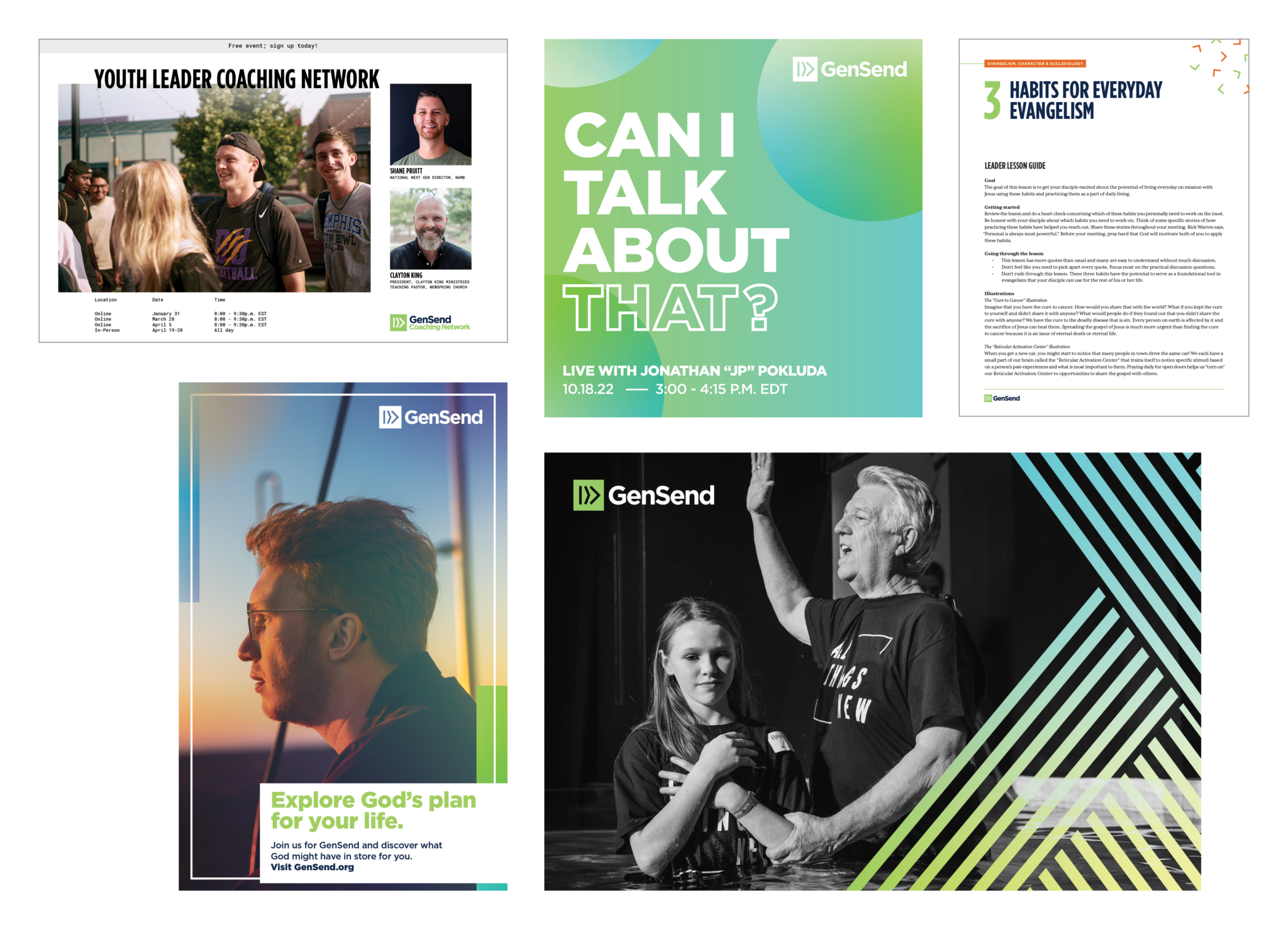
The following are examples of how we apply the various brand elements (patterns, background colors, graphics, typography, etc.) in a variety of ways to create a cohesive brand aesthetic. Whether you are creating original assets for Gensend or one of its brands, working off of a template or simply modifying an existing asset, please make sure to remain consistent with these aesthetic treatments unless instructed otherwise by the NAMB Creative Team.
