EVANGELISM
Description
Having gospel conversations can be an intimidating idea. NAMB provides practical resources and experiences to help prepare individuals and churches to share their faith. NAMB also provides insights to help pastors cast vision and create a culture of evangelism.
Purpose
Bring the gospel to places where the church may not be able to go
Colors
WYO BLUE
WEB: #27AAE1
CMYK: 70-15-0-0
PMS: 2171C
WYO GRAY
WEB: #333132
CMYK: 0-0-0-95
PMS: 447C
WYO LIGHT BLUE
WEB: #BAD5DC
CMYK: 26-7-10-0
PMS: 290C
Logos
Application
DO
Fill out our Project Approval Form when you use any of our assets.
DON'T
AESTHETIC
Using the logo:
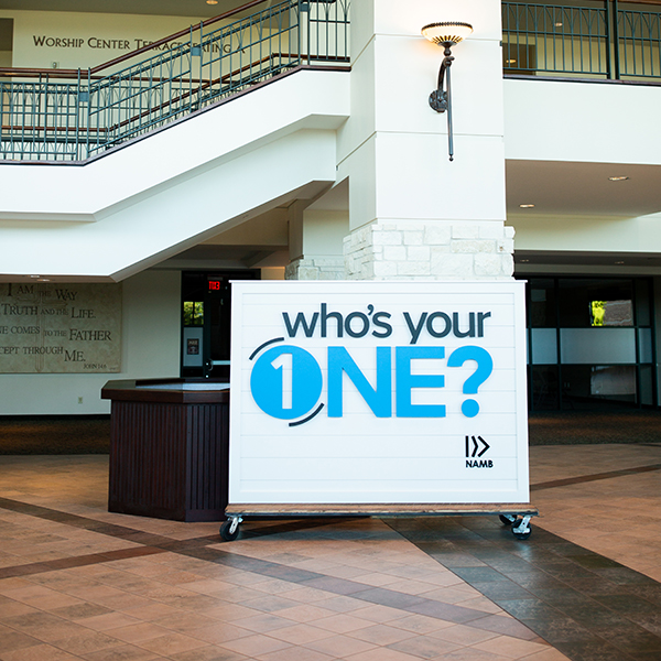
To protect the integrity of the Who's Your One brand visual identity, please avoid altering the logo in any way. Use the supplied logo files as is. You may scale the size of the logo if needed, but always scale proportionally. Any use of the Who's Your One brand mark or Who's Your One brand assets should be submitted to brandapprovals@namb.net for approval prior to use.
Please keep the following in mind when using the Who's Your One logo:
- Do not scale or colorize logo elements independently.
- Do not place on backgrounds that affect readability of the logo.
- Do not modify color or logo design or add any elements to the logo.
- Do not stretch or skew logo in any way. If scaling logo, ensure it is done proportionately.
- Do not rearrange logo elements.
- Do not crop or bleed off page.
- Do not place inside a non-approved holding shape.
- Do not tilt or rotate.
- Do not add dimension (emboss, drop shadows, etc.).
- Do not add stroke or outline.
- Do not misrepresent NAMB or affiliates.
- Keep sufficient clear space around logo.
Photography:
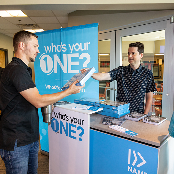
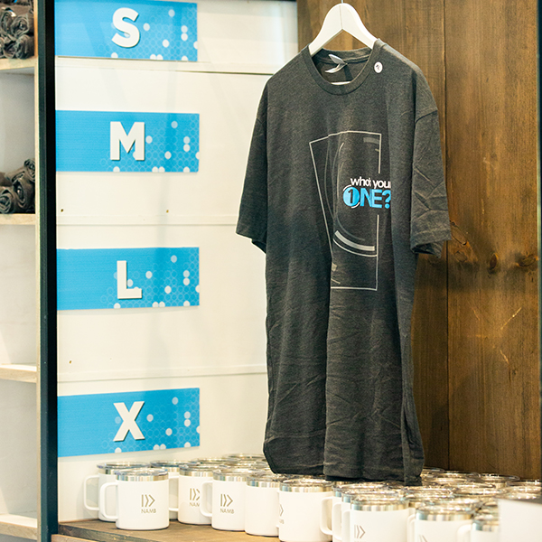
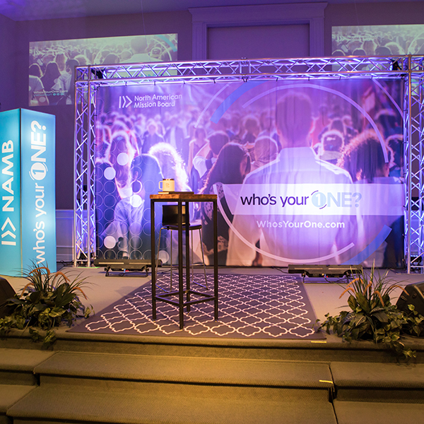
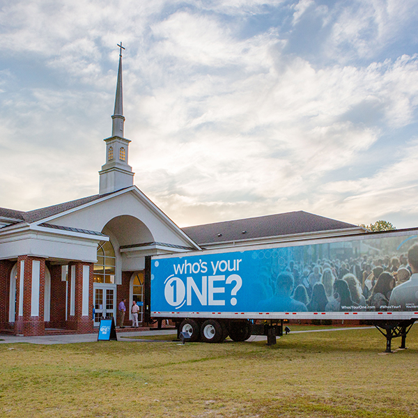
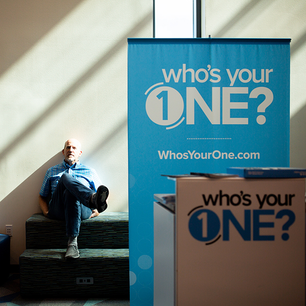
Photography should be the primary element used in Who's Your One designs to give a storytelling feel and evoke emotion. Who's Your One photography style is candid and aims to capture real, authentic moments that highlight the people and the ministries being featured. Natural lighting should be used whenever possible; avoid a direct flash or staged lighting. Use full-color photography as much as possible to bring color to design without relying solely on graphics. Duotones, if used, should be used sparingly and are typically best when used as a background/support image (although, full color photography with a dark overlay effect is preferred). With all of our photography, we strive to reflect the diversity in ethnicity, gender, age, background and community that our denomination represents.
Graphics:
Circles are used in various forms throughout Who's Your One pieces to intentionality.
Typography:
The Gotham font family is the primary brand font for Send Relief. Various weights may be combined when used appropriately. The font Better Times is a script font that we often use for headlines or special call-out text. Serif fonts may be used in small doses, but they should not be a primary font. For instance, Serif fonts are used on namb.net for quotations or news article titles, however Sans-serif fonts are still used for the majority of body copy.

