Description:
Send Network is a family of churches planting churches everywhere for everyone — reaching every community in North America with the hope of the gospel. With practical, relevant and contextualized opportunities and resources, Send Network makes church planting a team effort instead of a solo mission.
Brand Attributes:
Community-Focused. Diverse. Bold.
Key Audiences:
Planter Prospects — Believers who feel called to lead—and may even be in seminary to prepare—but don’t have a clear direction for what that will look like in a practical way; unaware of or intimidated by church planting
Current Church Planters — Boots-on-the-ground church planting missionaries who need support, encouragement, coaching and care on their church planting journey
SBC Pastors — Pastors of SBC churches who want to catalytically expand the reach of their ministry
Colors:
The Send Network color palette serves as a foundational component that works universally across all media. These colors anchor and balance the brand visually. Use the supporting secondary and tertiary colors to complement the system and strengthen brand recognition.
SEND NETWORK PRIMARY
WEB: #10294C
PMS: 2767
CMYK: 100 86 41 41
RGB: 16 41 76
SEND NETWORK PRIMARY
WEB: #18AEE1
PMS: 2995
CMYK: 71 11 1 0
RGB: 24 174 225
SEND NETWORK SECONDARY
WEB: #99CC67
PMS: 7487
CMYK: 44 0 79 0
RGB: 153 204 103
SEND NETWORK TERTIARY
WEB: #3C7CA0
PMS: 7697
CMYK: 79 44 23 2
RGB: 60 124 160
SEND NETWORK TERTIARY
WEB: #69C9CA
PMS: 325
CMYK: 55 0 24 0
RGB: 105 201 202
SEND NETWORK TERTIARY
WEB: #0C4843
PMS: 3305
CMYK: 89 49 65 44
RGB: 12 72 67
SEND NETWORK TERTIARY
WEB: #50B849
PMS: 361
CMYK: 70 0 99 0
RGB: 80 184 73
SEND NETWORK TERTIARY
WEB: #CFE7C8
PMS: 7485
CMYK: 19 0 27 0
RGB: 207 231 200
SEND NETWORK TERTIARY
WEB: #FBAC33
PMS: 130
CMYK: 0 37 90 0
RGB: 251 172 51
SEND NETWORK TERTIARY
WEB: #5C6670
PMS: 431
CMYK: 67 52 44 17
RGB: 92 102 112
SEND NETWORK TERTIARY
WEB: #ADB3B8
PMS: 421
CMYK: 33 23 22 0
RGB: 173 179 184
SEND NETWORK TERTIARY
WEB: #EBECED
PMS: 663
CMYK: 7 4 4 0
RGB: 235 236 237
Logos
Both the linear and stacked versions of the Send Network logo are approved configurations. When vertical space is limited, use the linear version, and when horizontal space is limited, use the stacked version. The Send Network Español logo is also approved for use in a Send Network Español context.
Using the logo:
To protect the integrity of the Send Network brand visual identity, please avoid altering the logo in any way. Use the supplied logo files as is. You may scale the size of the logo if needed, but always scale proportionally. Any use of the Send Network brandmark or Send Network brand assets should be submitted to brandapprovals@namb.net for approval prior to use.
Please keep the following in mind when using the Send Network logo:
- Do not scale or colorize logo elements independently.
- Do not place on backgrounds that affect readability of the logo.
- Do not modify color or logo design or add any elements to the logo.
- Do not stretch or skew logo in any way. If scaling logo, ensure it is done proportionately.
- Do not rearrange logo elements.
- Do not crop or bleed off page.
- Do not place inside a non-approved holding shape.
- Do not tilt or rotate.
- Do not add dimension (emboss, drop shadows, etc.).
- Do not add stroke or outline.
- Do not misrepresent NAMB or affiliates.
- Keep sufficient clear space around logo.
Photography:
Photography should be the primary element used in Send Network designs to give a storytelling feel and evoke emotion. Send Network’s photography style is candid and aims to capture real, authentic moments that highlight the people and the ministries being featured. Natural lighting should be used whenever possible; avoid a direct flash or staged lighting. Use full-color photography as much as possible to bring color to design without relying solely on graphics. Duotones, if used, should be used sparingly and are typically best when used as a background/support image (although, full color photography with a dark overlay effect is preferred). With all of our photography we strive to reflect the diversity in ethnicity, gender, age, background and community that our denomination represents.

Typography:
Send Network’s brand typography consists of two typefaces, Gotham and Mrs Eaves. These typefaces and their families of weights should be used as often as possible on all printed and digital applications. Commitment to these typefaces will create a consistent and strong identity. These typefaces are licensed and cannot be distributed for use. If a free typeface is needed, please download and install Montserrat in place of Gotham and Libre Baskerville in place of Mrs Eaves. Both of these fonts are free downloads.
BRAND AESTHETIC:
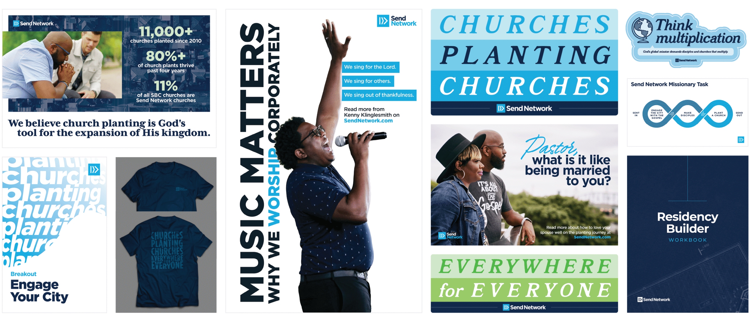
The following are examples of how we apply the various brand elements (colors, logos, photography, typography, shapes, etc.) in a variety of ways to create a cohesive brand aesthetic. Whether you are creating original assets for Send Network, working off of a template or simply modifying an existing asset, please make sure to remain consistent with these aesthetic treatments unless instructed otherwise by the NAMB Creative Team.


