Description:
Brand Attributes:
Relational. Action-Oriented. Practical.
Key Audiences:
SBC Pastor—Church leaders who want to be equipped to engage their congregations to meet needs and respond to crisis
SBC Church Member—People moved to participate in domestic and global outreach opportunities by serving, giving and praying
Colors:
The Send Relief color palette serves as a foundational component that works universally across all media. These colors anchor and balance the brand visually. Use the supporting secondary and tertiary colors to complement the system and strengthen brand recognition.
SEND RELIEF PRIMARY
WEB: #10294C
PMS: 2767
CMYK: 100 86 41 41
RGB: 16 41 76
SEND RELIEF PRIMARY
WEB: #FFCB0F
PMS: 116
CMYK: 0 20 98 0
RGB: 255 203 15
SEND RELIEF SECONDARY
WEB: #E56B27
PMS: 1585
CMYK: 6 71 98 0
RGB: 229 107 39
SEND RELIEF TERTIARY
WEB: #3C7CA0
PMS: 7697
CMYK: 79 44 23 2
RGB: 60 124 160
SEND RELIEF TERTIARY
WEB: #69C9CA
PMS: 325
CMYK: 55 0 24 0
RGB: 105 201 202
SEND RELIEF TERTIARY
WEB: #0C4843
PMS: 3305
CMYK: 89 49 65 44
RGB: 12 72 67
SEND RELIEF TERTIARY
WEB: #A34A28
PMS: 1535
CMYK: 26 79 95 18
RGB: 163 74 40
SEND RELIEF TERTIARY
WEB: #A92D24
PMS: 7627
CMYK: 23 95 98 16
RGB: 169 45 36
SEND RELIEF TERTIARY
WEB: #FBAC33
PMS: 130
CMYK: 0 37 90 0
RGB: 251 172 51
SEND RELIEF TERTIARY
WEB: #FFC56D
PMS: 1355
CMYK: 0 25 65 0
RGB: 254 197 111
SEND RELIEF TERTIARY
WEB: #E5DED3
PMS: 7527
CMYK: 7 8 13 2
RGB: 229 222 211
SEND RELIEF TERTIARY
WEB: #A34A28
PMS: 1535
CMYK: 26 79 95 18
RGB: 163 74 40
Logos:
These are the approved configurations for the Send Relief logo. The stacked version should primarily be used, however the linear version is also acceptable when it works better in the available space and format. When vertical space is limited, use the linear version, and when horizontal space is limited, use the stacked version.
Using the logo:
To protect the integrity of the Send Relief brand visual identity, please avoid altering the logo in any way. Use the supplied logo files as is. You may scale the size of the logo if needed, but always scale proportionally. Any use of the Send Relief brand mark or Send Relief brand assets should be submitted to brandapprovals@namb.net for approval prior to use.
Please keep the following in mind when using the Send Relief logo:
- Do not scale or colorize logo elements independently.
- Do not place on backgrounds that affect readability of the logo.
- Do not modify color or logo design or add any elements to the logo.
- Do not stretch or skew logo in any way. If scaling logo, ensure it is done proportionately.
- Do not rearrange logo elements.
- Do not crop or bleed off page.
- Do not place inside a non-approved holding shape.
- Do not tilt or rotate.
- Do not add dimension (emboss, drop shadows, etc.).
- Do not add stroke or outline.
- Do not misrepresent NAMB or affiliates.
- Keep sufficient clear space around logo.
Photography:
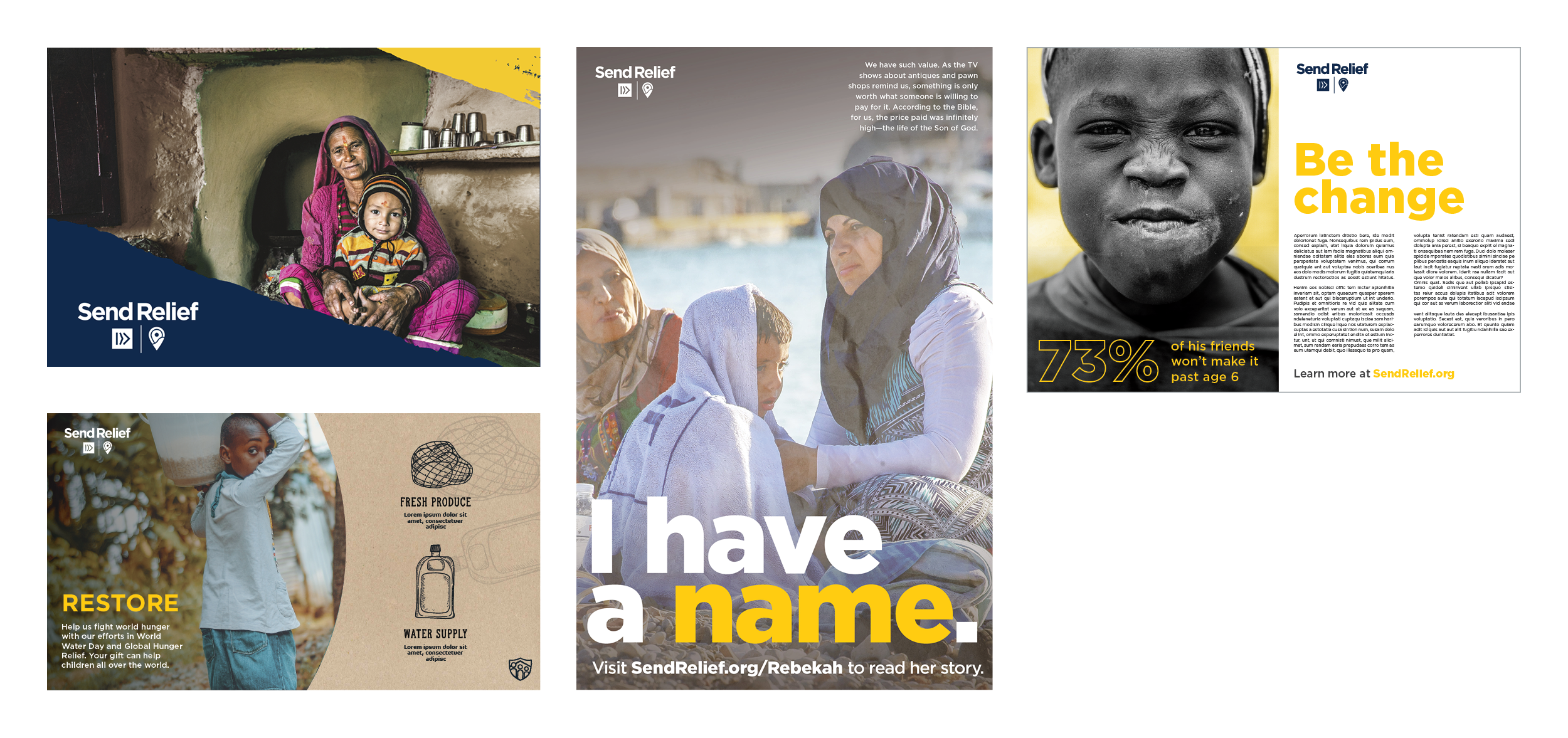
Photography should be the primary element used in Send Relief designs to give a storytelling feel and evoke emotion. Send Relief’s photography style is candid and aims to capture real, authentic moments that highlight the people and the ministries being featured. Natural lighting should be used whenever possible; avoid a direct flash or staged lighting. Use full-color photography as much as possible to bring color to design without relying solely on graphics. Duotones, if used, should be used sparingly and are typically best when used as a background/support image (although, full color photography with a dark overlay effect is preferred). With all of our photography, we strive to reflect the diversity in ethnicity, gender, age, background and community that our denomination represents.

Graphic Devices:
Send Relief’s graphic elements consists of patterns, natural textures, handwritten type and graphic elements. These graphics and patterns can be used on their own over solid backgrounds, photographs or used as masks for photography. These elements should only occur in the brand’s color palette.





Typography:
Send Relief’s brand typography consists of two typefaces, Gotham and Mrs Eaves. These typefaces and their subsequent weights should be used as often as possible on all printed and digital applications. Commitment to these typefaces will create a consistent and strong identity.
If a free font is needed, please use Montserrat in place of Gotham and Baskerville in place of Mrs Eaves. These fonts are available on Google Fonts.
Brand Aesthetic:
The following are examples of how we apply the various brand elements (patterns, background colors, graphics, typography, etc.) in a variety of ways to create a cohesive brand aesthetic. Whether you are creating original assets for Send Relief or one of its brands, working off of a template or simply modifying an existing asset, please make sure to remain consistent with these aesthetic treatments unless instructed otherwise by the NAMB Creative Team.
